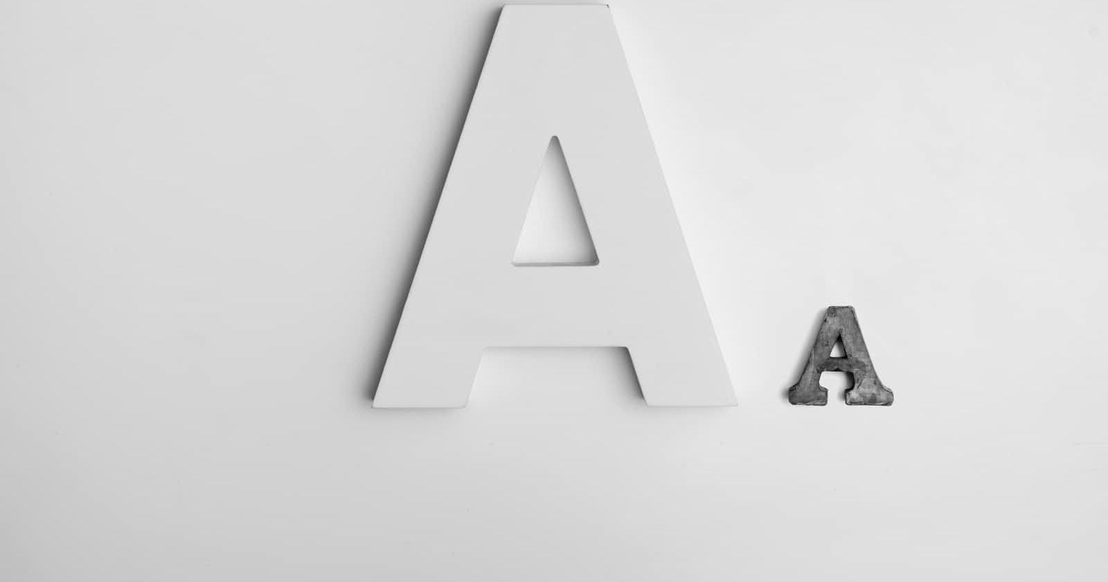
Photo by Alexander Andrews on Unsplash
The Power of Typography: Elevate Your Designs with Impactful Type
Unlocking the Power of Typography: Essential Tips for Effective Design Composition
Introduction
Typography is a powerful tool in design that can transform your creations from ordinary to extraordinary. In this article, we'll explore the transformative power of typography and provide valuable tips to help you use it effectively in your designs.
Get ready to embark on a typographic journey that will revolutionize your approach to visual communication.
Choose the Right Typeface 🔠
Selecting the appropriate typeface is crucial for conveying the intended tone and personality of your design. Consider factors such as readability, legibility, and the emotions associated with different typefaces. Experiment with a variety of fonts to find the one that best aligns with your message and resonates with your target audience.
Establish Visual Hierarchy 🔝
Typography plays a crucial role in guiding the viewer's attention and creating a visual hierarchy. Utilize font sizes, weights, and styles to emphasize key elements and establish a clear hierarchy of information. By strategically arranging type, you can lead the viewer through your design and highlight the most important content.
Play with Font Pairing✍️
Font pairing is an art that involves combining complementary typefaces to create visual interest and harmony. Experiment with contrasting styles, such as pairing a serif with a sans-serif or a script with a geometric font. Strive for a balance that adds depth and personality to your design while maintaining readability and coherence.
Utilize White Space 😶🌫️
White space, or negative space, is the empty area around and within your typography. Embracing ample white space allows your type to breathe and stand out, enhancing legibility and overall aesthetics. It creates a sense of balance and helps draw attention to the essential elements of your design. Use white space intentionally to create a visually pleasing composition.
Experiment with Typography Effects💫
Explore different typographic effects to add visual interest and express the theme or mood of your design. Experiment with techniques like letter spacing, line spacing, shadowing, and blending modes. But exercise caution – use effects sparingly and purposefully to avoid overwhelming the viewer or compromising readability.
Consider Brand Consistency ♣️
Typography plays a significant role in establishing and maintaining brand consistency. Choose typefaces that align with your brand's visual identity and use them consistently across various platforms and marketing materials. Consistent typography helps reinforce your brand's personality and improves brand recognition.
Pay Attention to the Alignment 🎯
Alignment is essential for creating a visually cohesive and professional design. Ensure that your typography is aligned properly with the design elements and other visual elements on the page. Consistent alignment enhances readability and gives your design a polished and well-structured appearance.
Optimize for Accessibility ♿
Accessibility should always be a priority in design. Consider factors such as color contrast, font size, and readability for users with visual impairments. Use accessible typefaces and ensure that your typography meets accessibility standards, enabling a wider audience to engage with your content.
Don't overcrowd your design 🤹♂️
In the world of typography, less is often more. When it comes to creating impactful designs, it's crucial to avoid overcrowding your compositions with an excessive amount of text. Overcrowding can lead to visual clutter and diminish the overall impact of your message. Instead, strive for simplicity and allow your typography to breathe.
To avoid overcrowding, establish a clear hierarchy within your typography. Determine the most crucial information and give it prominence, using larger font sizes, bold styles, or different colors. This ensures that the key messages stand out and are easily digestible for the viewer. Supporting details should have smaller sizes or lesser emphasis, allowing them to complement the primary content without overwhelming the design.
Conclusion
Typography has the power to elevate your designs and enhance the effectiveness of your visual communication. By choosing the right typeface, establishing visual hierarchy, experimenting with font pairing and effects, utilizing white space, considering brand consistency, paying attention to alignment, and optimizing for accessibility, you can create designs that captivate and leave a lasting impression.
Embrace the art of typography and let it be your guide in conveying your message effectively and aesthetically. Elevate your designs and harness the true power of typography to make a meaningful impact.🚀✨
